In today’s data-driven world, effective data visualization is essential for transforming raw data into actionable insights. Microsoft’s Power BI has emerged as a leading business intelligence tool that enables users to create engaging and interactive visualizations. One of the most popular visualization types is the pie chart, known for its simplicity and ability to provide a quick understanding of the proportions and relationships between categories. In this article, we will empower you with techniques that can elevate your pie chart analysis to the next level.
Sometimes Power BI doesn’t have the solution you are seeking out of the box, and for BI developers this could mean it is party time as you will probably need to get creative and find a workaround.
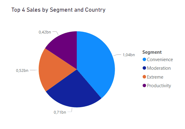
If you want to control the number of slices you can find in a pie chart and display just the most relevant ones, you can write a TopN measure to quickly transform your messy visual from this:
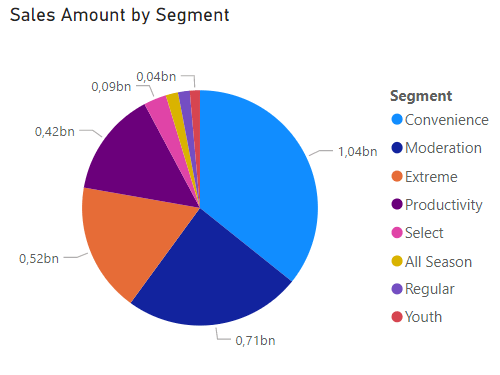
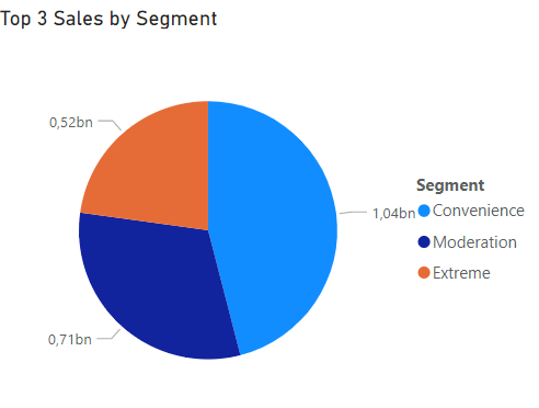
To this:
With a Sales measure like the one bellow
Sales Amount = SUM( Sales[Revenue] )You can easily calculate the top 4 segments with most sales and put it in the context of the piechart
Top 4 Sales =
CALCULATE(
    [Sales Amount],
    KEEPFILTERS(
        TOPN(
            4,
            ALLSELECTED('Product'[Segment]),
            [Sales Amount]
        )
    )
)
Now imagine that you want to add the dimension Country to the pie chart and when drilling it down you want to display only the country TopN sales by country. How can you do that?
There is a DAX Function called ISINSCOPE() that, according to Microsoft, “returns true when the specified column is the level in a hierarchy of levels”. But in a nutshell, just evaluates if a centain column is in scope.
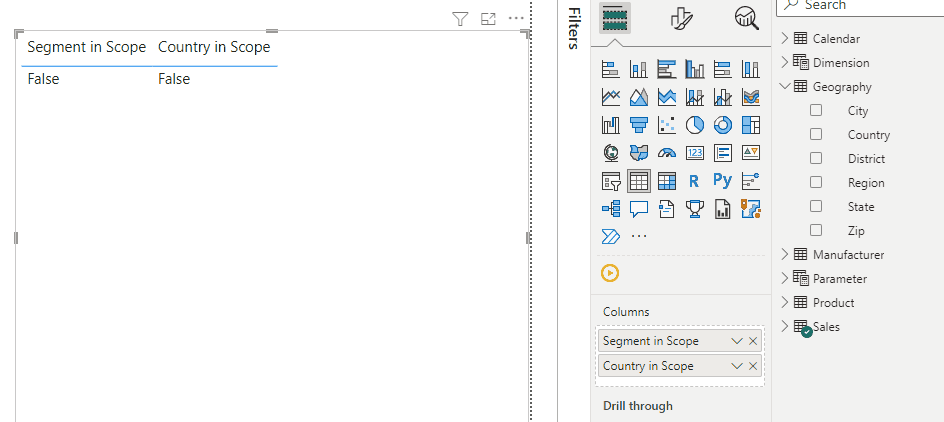
I’ve created two measures in order to be easyer to understand
Country in Scope = ISINSCOPE(Geography[Country])


Segment in Scope = ISINSCOPE('Product'[Segment])
By adding this two measures to a table, you can see how they change to TRUE when their columns are added to the table
We can also add this measures to a piechart tooltip and test them.
In the above gif we can conclude that:
- Only Segment is in scope on the first level
- Segment and Country are in scope when drilling in a pie slice
- Only Country is in scope when going in to the next level
We can see how can ISINSCOPE() will help us manipulate a measure through different drilldown stages, and by evaluating which dimension is in scope we can provide diferent filters when we are calculating the Sales Amount measure.
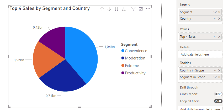
You can find bellow a measure that evaluates which dimension is in scope and returns top 4 sales by applying the corresponding TopN filter
Top 4 Sales =
var _top = 4
RETURN
    SWITCH (
        TRUE (),
        ISINSCOPE ( Geography[Country] ) && ISINSCOPE ( 'Product'[Segment] ),
            CALCULATE(
                [Sales Amount],
                KEEPFILTERS(
                    TOPN(
                        _top,
                        ALLSELECTED(Geography[Country]),
                        [Sales Amount]
                    )
                )
            ),
        ISINSCOPE ( 'Product'[Segment] ),
        CALCULATE(
                [Sales Amount],
                KEEPFILTERS(
                    TOPN(
                        _top,
                        ALLSELECTED('Product'[Segment]),
                        [Sales Amount]
                    )
                )
            ),
		ISINSCOPE ( Geography[Country] ),
        CALCULATE(
                [Sales Amount],
                KEEPFILTERS(
                    TOPN(
                        _top,
                        ALLSELECTED(Geography[Country]),
                        [Sales Amount]
                    )
                )
            )
    )
This way, when are at the first level we will only see the top 4 sales by Segment, when we drill it down we will see the top 4 sales by Country related to the pie that was drilled, and when we go to the next level, we will see the top 4 sales by Country.
ISINSCOPE() can always be useful when you are working with hierarchies in all sort of visual, especially when you want to manipulate the calculation based on a certain hierarchy level.
In conclusion, mastering pie chart slicing can greatly enhance your data visualization and analysis. Also having I ISINSCOPE() funcion in your tool set, can be helpful to provide additional context to Power BI visuals. By applying these techniques and functions, you’ll create engaging and informative pie charts that drive data-driven decision-making. We hope this article has inspired you to explore the full potential of Power BI’s pie chart capabilities and further elevate your data visualization expertise.


0 Comments