It is common to compare actual values and targets to know if we are doing well or not. With Power BI, you can accomplish that in several different ways.
For example, you can use conditional formatting in a table or a matrix to color the background or the font or add icons next to the data to quickly check if you are on target.
If we want to visualize this comparison more graphically, we could create a chart instead, having, for example, a combo chart with the actual value on the columns and the target on a line or even a simple line chart with multiple lines representing the value and the target.
But sometimes, the charts can look cluttered with multiple lines or columns, especially if you have more than one reference value to compare your data with.
An alternative way to make the comparison is by coloring the chart’s background based on the defined targets or reference values. To accomplish that, you may use Error bars.
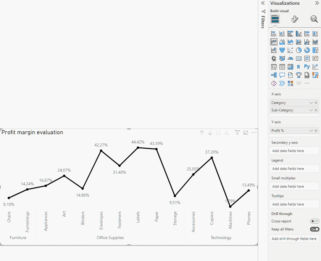
First things first, let’s take a look at our example’s model:
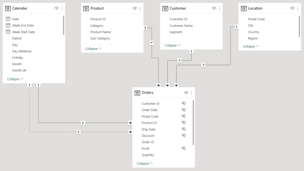
It is a simple sales model, containing the Orders as the fact table and four dimension tables: Calendar, Product, Customer, and Location.
For this example, we have the measures Profit %, which calculates the profit over the Gross Sales Amount, and Profit Target %, which I just set to 15%.
Profit % =
DIVIDE(
    [Profit amount],
    [Gross Sales amount]
)
Profit target % = 0.15Now that we know our model and main measures, the first step is creating the chart.
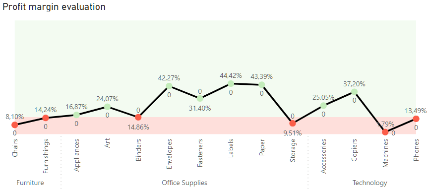
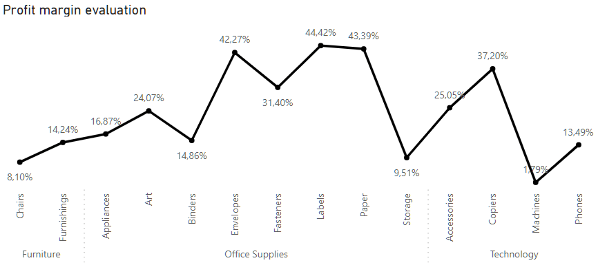
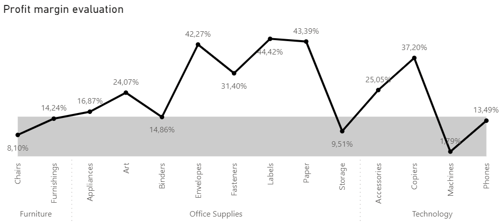
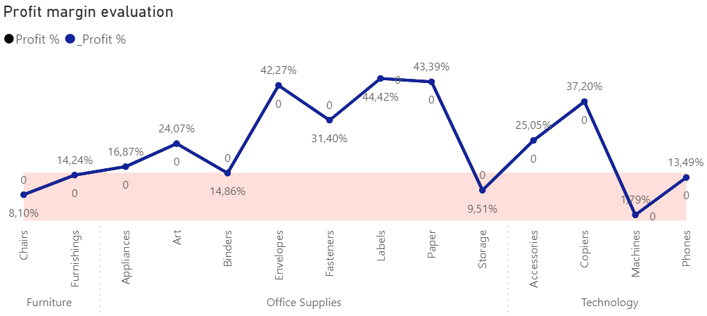
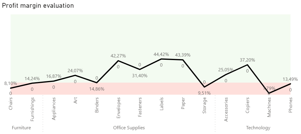
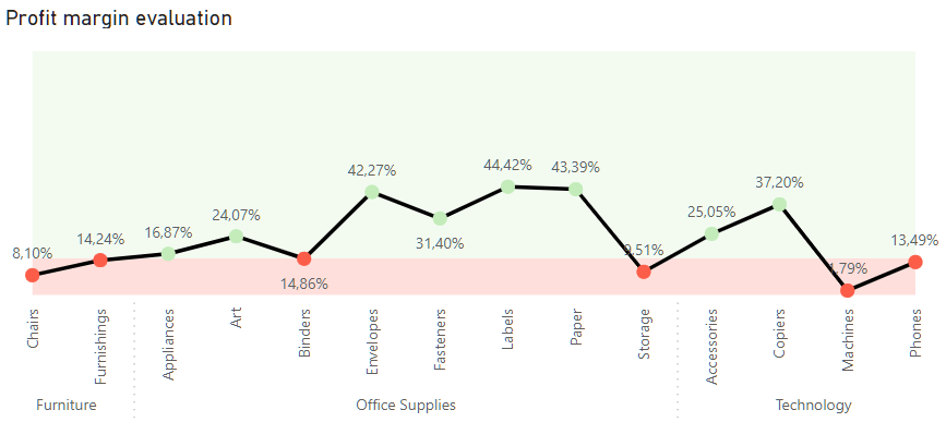
Let’s analyze the evolution of our product’s category and subcategory profit margin.
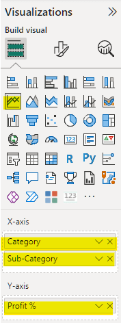
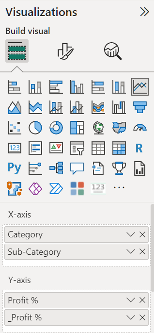
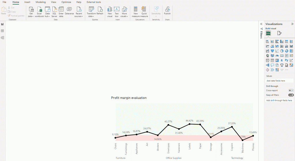
For that, we create a line chart with the Category and Subcategory of our product on the X-axis and add our Profit % to the Y-axis.
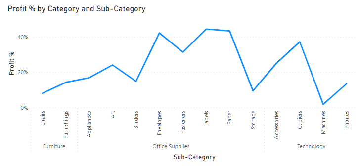
I will make it look more beautiful by removing the axis titles and the Y-axis and changing the title. Let’s also change the line’s color to black, add markers, and finally set the data labels to on. Now it looks a little better 🙂
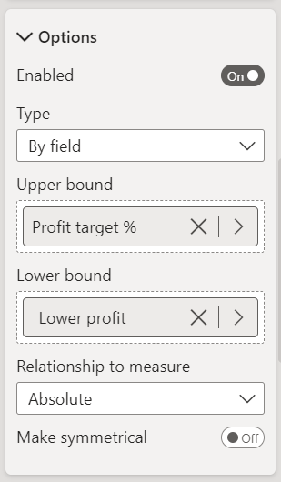
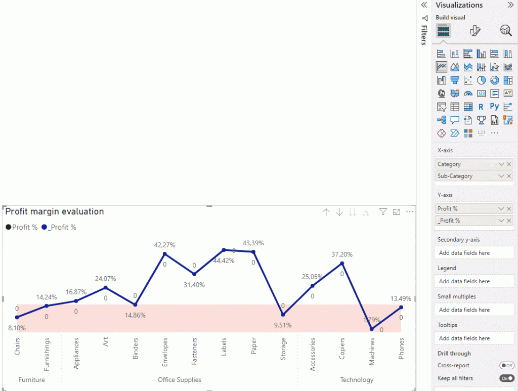
The next step is to add the error bars to match our target. For that, we go to the Analytics area of the Visualization pane and enable the Error Bar option.
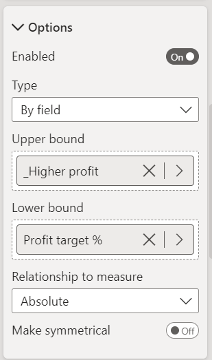
In the error bar section, we are asked to add a lower and an upper bound for the error bar. As we only have one target, we want to divide the chart into two sections: above and under target.
So imagine our lowest possible profit is 0% and our highest potential target is 100%. We need to create two measures containing these boundaries. I called these measures _Lower profit and _Higher profit and formatted both as percentages.
_Lower profit = 0_Higher profit = 1Now, we first want to create a region below the target, and for that, our lower bound is the _Lower profit, while the upper bound is the target itself (Profit target %).
When we add the boundaries, a bar from zero to the target will be created, which is not exactly what we want.
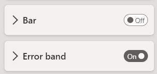
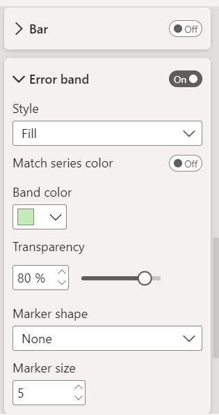
So to get rid of the bars and color the background instead, we need to disable the bars and enable de Error band.
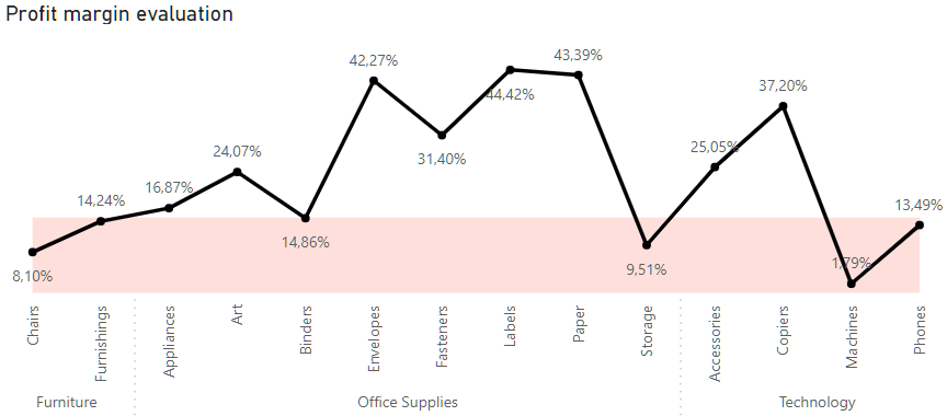
When we do that, the bars are automatically replaced by a grey band because it matches the series color, but we can format it and color it with any other color. Let’s paint it red, for example:
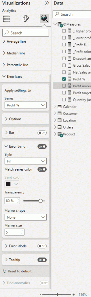
You could also play around with the transparency and add markers to the error band. But we are good without it.
Now, we want to color the above target part of the chart.
That part is not as straightforward as we would like. That is because we can only add one error bar per measure used in the chart.
That said, we can work that around by creating a dummy measure that has precisely the same value as the profit. I called this measure _Profit % and added that to the chart.
_Profit % = [Profit %]Now we add the dummy measure to the chart Y-axis.
Adding the second measure to the chart will create a legend and overlap the existing line with another line with the same values. We can format the chart to disable the legend and remove the line, the marker, and the label for the dummy measure.
Now, we need to configure the error bars to the dummy measure, similar to what we did for the actual Profit %. The difference is that we need to specify the _Profit % series on the Apply setting to option.
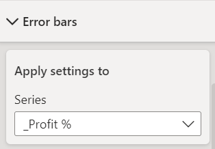
As we now want the upper band, the error bar goes from the Profit to the Highest Profit, which is 100%. So for that, we will add the Profit % as the lower bound and the _Highest Profit as the upper bound.
Next, we will disable the Bar, enable the Error band, and change its color to green:
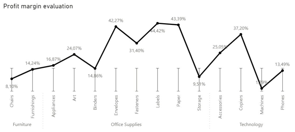
Good, now the background is colored and matches the target!
Another thing that may be interesting here is to color the marker green when the data point is above the target and red otherwise. First, add a new measure that checks if the profit is under or over the target and select the color for each case. I called the measure _Profit color.
_Profit color =
IF(
    [Profit %] >= [Profit target %],
    "#C3ECBA",
    "#FB5D49"
)
Notice that there are no conditional formatting options on the marker color. To achieve that, we will need another workaround.
We can copy and paste the chart we created, change it to a column chart, and delete the dummy measure from it.
In the Format options, go to Columns and select the conditional formatting option to the color. Then, we choose the Format style as the Field value and place our _Profit color measure in the field option.
Now with the formatted bar chart, we can select it, click on format painter on our ribbon and click on our line chart with the colorful background. It should work like a charm.
The last thing to do is to disable the tooltip option so it doesn’t show the error bands values when we hover over the chart.
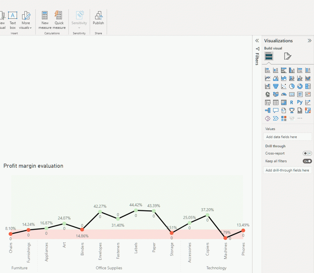
And now we have our final chart, with the background and the markers colored according to the target.
PS>cope:
If you want to know more about our services and how we can help grow your business, click here to learn more about us. Also, don’t miss the many tips for Power BI and other tools we regularly share on our YouTube channel.
Finally, stay tuned for DevScope’s free events, such as “Dashboard in a Day”, to further expand your knowledge and experience with Power BI.


0 Comments